5 tips for better online stores UX

The giants of the ecommerce world, such as Amazon and Ebay, understand very well the impact of a site navigation on shoppers' experience. That is why they put massive efforts into the research and towards making their navigation easy, appealing and effective. Here are 5 tips for site navigation we learned from the best in class.
The experience shoppers get when visiting your online store has a big impact on the success of the store. While user experience may vary, it generally comes down to either of these two options: if site navigation options are limited, or the process is too complicated or inefficient, then the user experience may be frustrating, and the shoppers will quickly move on to the next store. But if the store offers good navigation tools, allowing shoppers to easily refine their results by selecting relevant attributes, then their experience most likely would be positive, and they will come back to the store time after time.
The giants of the ecommerce world, such as Amazon and Ebay, understand very well the impact of an efficient site navigation on shoppers' experience. That is why they put massive efforts towards making their navigation so easy and appealing. The shoppers, on their part, have come to expect such navigation experience in every online store they go to.
Why Do We Need Navigation Tools?
Giving customers the option to narrow down their initial search results to only relevant products has two distinct benefits:
First, allowing shoppers to focus only on the products most relevant to them by slicing through results, according to their preferred attributes, makes for a great user experience. As a result, the shoppers will continue to visit your store and become your loyal customers.
The other benefit is that navigation caters to both types of online shoppers - browsers and searchers. The browsers may find navigation a great place to begin their window shopping experience and discover new products the store offers, while the searchers can use it as a quick and easy way to find exactly what they are looking for. In both cases, navigation will boost up conversion rates and overall sales.
Tips for Enhancing Your Site Navigation
To help you improve the navigation experience in your online store, we gathered a few tips you can apply:
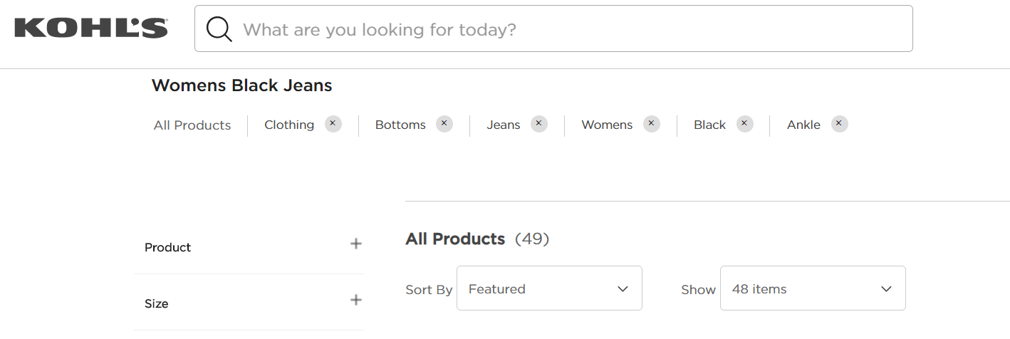
1. Offer Relevant Attributes
It is intuitive to think that the more attributes you offer your customers - the better off they would be. This is a mistake. Too many options, and especially irrelevant ones, will only frustrate the shoppers and hurt their experience. When deciding which attributes to offer, sellers should keep in mind the following:
- Use attributes that are relevant for the products you sell. Avoid piling up attributes just for the sake of having them. Attributes that don’t help shoppers refine their results cause more harm than good. Learn what attributes you should offer for which products by studying your customers’ habits and the market in general.
- Keep it simple. Navigation should be easy and intuitive to all customers. Don’t get too technical or specific, to the point where the shoppers don’t understand what the attributes mean. They should know exactly what each attribute gives them.
- Listen to your customers. Know what their preferences and habits are, and arrange navigation in accordance to them. Popular attributes should be highly visible, to make sure that the shoppers easily find them and use them.
- Attributes are flexible. Keep in mind that some attributes are relevant to a wide number of categories and product types, whereas some are relevant only to specific products. For example, the ‘color’ attribute may be applied to almost all categories, while the ‘head size’ should only apply to hats.
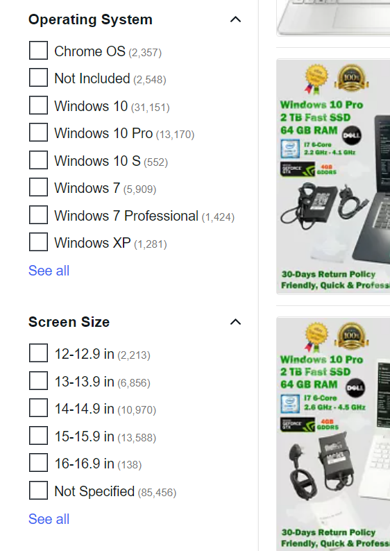
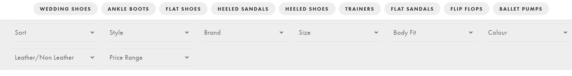
2. Display the Number of Possible Results
You can show your customers how efficient their navigation is by showing them the number of products tagged in each attribute. The numbers should automatically change to reflect the application of a new attribute. For example, when searching for a laptop, we will usually find the ‘screen size’ and ‘processor’ attributes, among others. Next to each of these attributes there should be the number of products that correspond to each attribute. However, when we select a 14 inch screen, the number next to the ‘processor’ should be adjusted to reflect the number of laptops with a 14 inch screen for each processor.
This helps shoppers navigate their way to the products they want, by showing them the most efficient way to get there. Let’s say a shopper wants to buy a 14 inch screen laptop with a 10th generation processor. If the store offers hundreds of 14 inch screen laptops, but only twenty with the desired processor, then the shopper can quickly slice through much more results by using the ‘processor’ attribute. Helping your customers to quickly find the products they are looking for in just a few clicks, increase the overall page access numbers and drive up conversion rates.
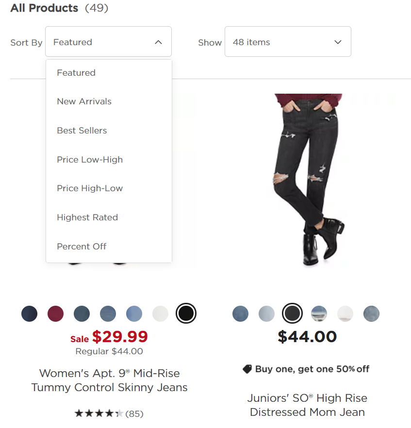
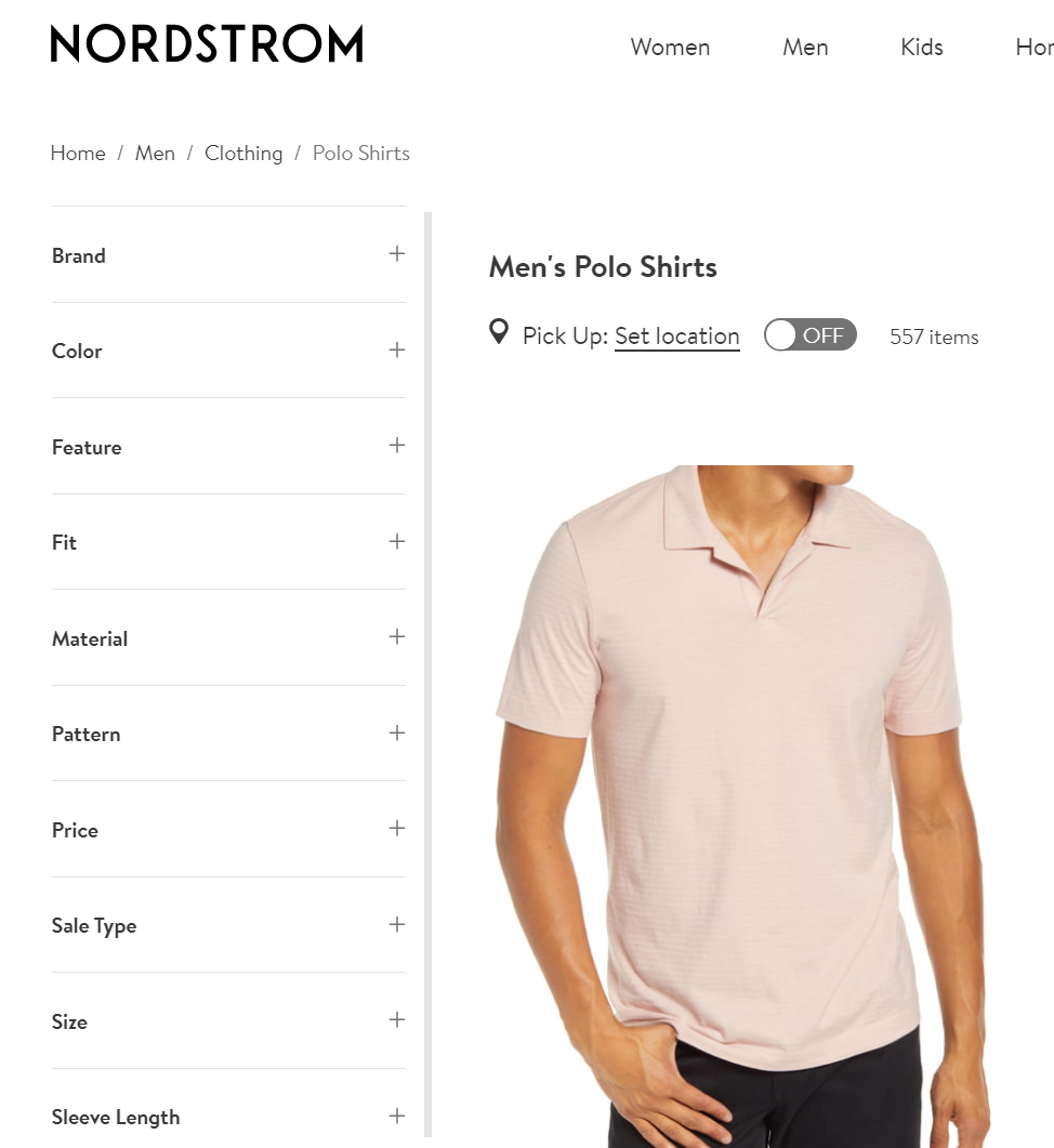
3. Help Customers Sort the Results
Site navigation allows shoppers to refine their results, and quickly find the products they are interested in. But we know that not all shoppers are like that. The browsers, those who come to online stores to window-shop or to see what’s new, tend to… well, browse through their results, looking for deals or something that catches their eye. Allowing these shoppers to sort the results by their preferred criteria is crucial, because it helps them find the products most relevant to them.
For instance, a shopper is interested in buying a medium size polo shirt, and has no preference as to the other attributes of the shirt. What’s important to that shopper is the price. A search for “medium size polo shirt” will probably give back hundreds of results, but since no other attributes are important to the shopper, they may prefer to sort the results by price, to find the best deals on polo shirts. Of course, if the shopper then decides to apply more attributes, they may do so, while keeping the sorting they selected, bringing them much closer to the product of their liking.
4. Let Customers Quickly Reselect Attributes
Site navigation is sometimes a process of trial and error. At times we realize the attribute we selected doesn’t narrow down the results as expected, and sometimes we just make mistakes, by clicking in the wrong place. It is very important for the shoppers to have the ability to easily change their selections, by quickly applying and removing attributes, without having to begin a new search or reloading the page.
Remember, shoppers want a streamlined experience, in which everything is clear, quick and easy to do. Providing them with such an experience certainly helps increase conversion rates.
5. Adjust to Both Mobile and Desktop
As we have said before, the site navigation should be accessible to as many shoppers as possible. Today, with the rapidly increasing popularity of mcommerce, sellers cannot neglect this aspect, and must create a mobile version of their online store.
Unsurprisingly, mcommerce shoppers have developed different preferences from those of the “traditional” ecommerce shoppers. The use of small screens, for example, has prompted mcommerce shoppers to prefer tapping over writing, hidden menus and navigation tools over fixed ones, and more.
Listed below are some recommendations for you to apply to the mobile version of your online store:
Use Separate Displays
Displaying the navigation tool on the same screen as the results may be good for the desktop version, but on the small screens of mobile devices it might be too overcrowded and hard to handle. Instead, separate the two by offering a unique display for each. When the shoppers want to select attributes, they should see a display uniquely dedicated to navigation that covers the entire screen. Once the relevant attributes are selected, the shoppers are then displayed only the list of relevant results, making it much more convenient to view. This makes sure that no matter the screen size, you provide the shoppers a great customer experience.
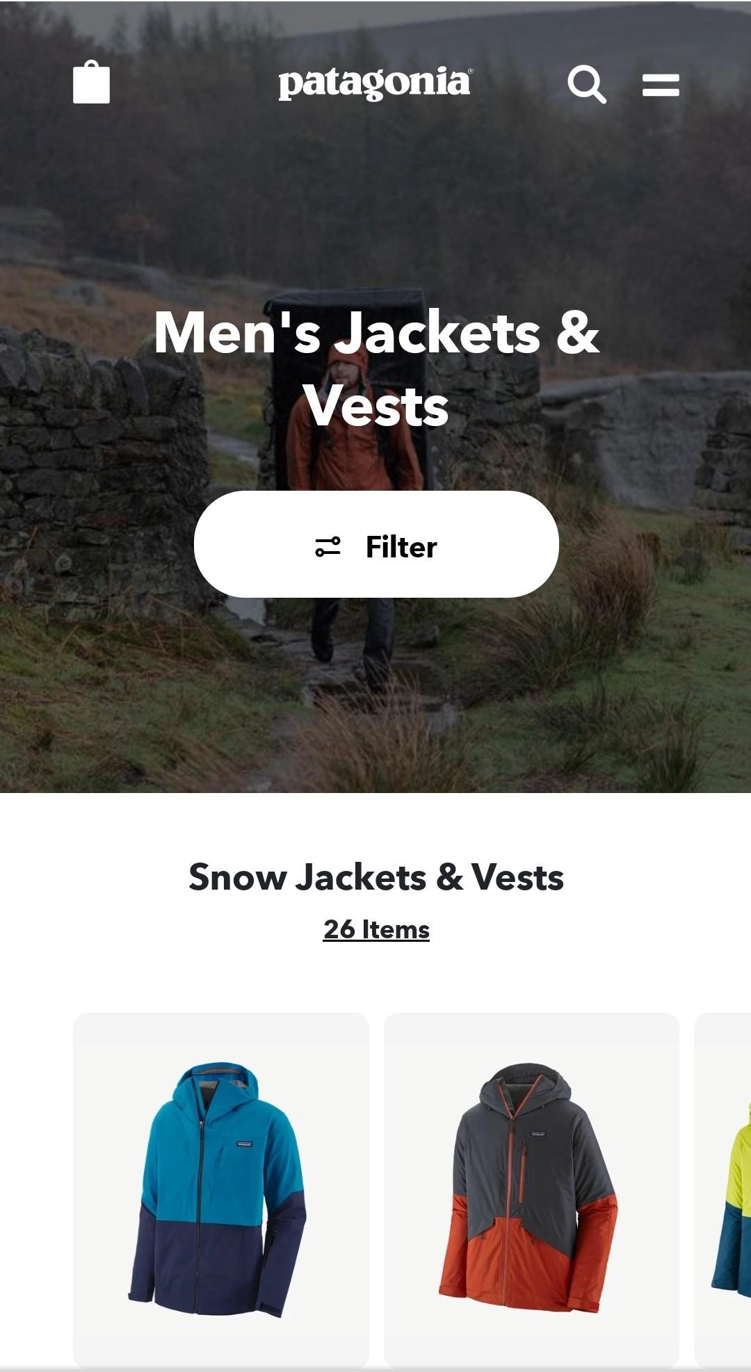
Products Display
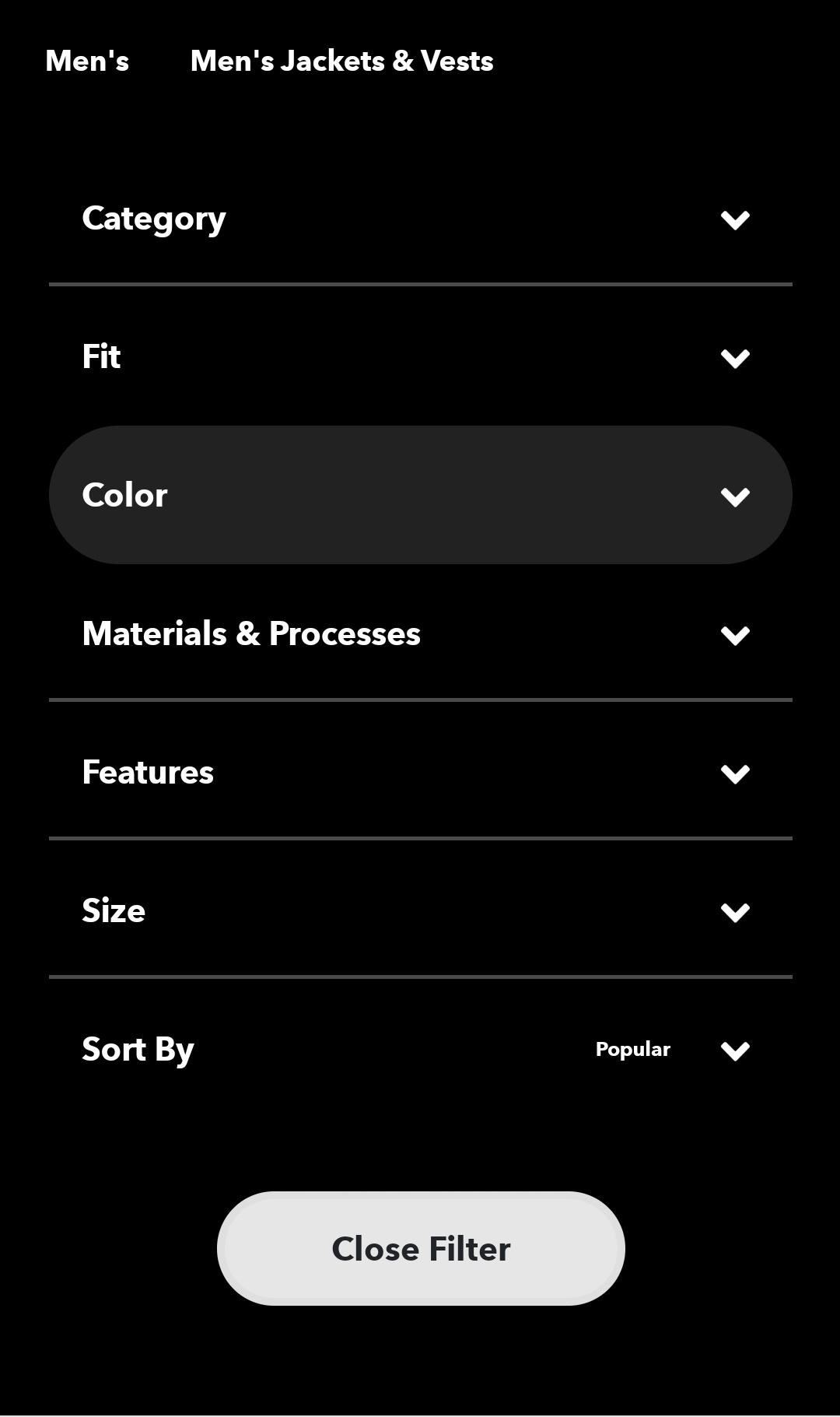
Filter Display
Show Shoppers Where They Are
We recommend letting your customers know where they are in the store at all times. Displaying this information - such as which attributes are currently applied - at the top of results page is the best way to do that. This helps the customers to assess how efficient their navigation is, and adjust it accordingly.
You may want to emphasize this information, based on your customers’ habits. If you know your customers like to try out different attributes, then you should make the attribute information very visible and accessible to them. But if your customers usually know exactly what they are looking for and where they navigate to, then you may want to give the search results a bigger portion of the screen.
Use Different Types of Navigation Bars
There are two types of navigation bars: horizontal and vertical. The horizontal bar, situated at the top of the page, allows shoppers to keep track of the attributes they have applied. However, since the size of horizontal bars is limited (you don’t want it to cover the entire page), often it doesn’t show all available attributes, which forces the shopper to take specific actions in order to see them all. This makes for a bad customer experience.
Vertical bars, on the other hand, provide much more space for content. They are very useful when browsing categories, as they allow shoppers to refine their results by rapidly trying out different attributes. In mobile devices, however, as screen real estate is much more valuable than PC, vertical bars tend to take over much of the screen, making the browsing experience much slower and frustrating.
A smart approach would be to determine which of the two to use, based on the screen size or platform used. Horizontal bars, with their efficient data to screen usage ratio, usually fit the mobile version better, while vertical bars better fit big screens, such as PCs. Whatever you decide, make sure that your navigation tool works efficiently on all platforms.
Horizontal Bar
Vertical Bar
Create a Better Navigation Tool For Your Customers
The benefits of good site navigation are obvious: shoppers have a better shopping experience, which leads them to come back to your store, which in turn improves sales. When creating a navigation tool, sellers must take into account several factors that might have a significant impact on the tool’s efficiency. Sellers should learn about their customers’ habits and preferences, and build their site navigation in a way that best caters to them.
 See all posts