Improve your site navigation with these 9 tips

Site navigation helps minimize the irrelevant browsing time by showing the shoppers only the results relevant to them. When site navigation is done right, it can also contribute to significant improvements in sales and conversion rates. Here are 9 tips to improve your site navigation
Online shopping is fast becoming a bigger part of our daily lives, and with increasingly growing competition, sellers must stay at the top of their game in order to stay relevant. A big part of this game is providing your customers such a good user experience, that they will come back to shop at the store time after time. The most significant way sellers can improve their store’s user experience is by offering customers site navigation, which allows them to find the products they are looking for quickly and conveniently. Because site navigation is so important, we gathered a few tips that we believe every seller should know in order to fully enjoy the benefits of the tool.
Site navigation, also called faceted search or attribute navigation, is a tool that helps shoppers focus on the products they are interested in. By letting shoppers refine their searches by choosing the specific attributes of the products they are looking for, site navigation allows them to narrow down the search results to only the most relevant products.
For instance, when purchasing a laptop in an online store, the multitude of options may be confusing. Different brands, screen sizes, RAM sizes, processors, and of course, a wide range of prices. How can you find what you are looking for among so many options? Site navigation gives customers the option to navigate through the results by selecting specific attributes of the product they are after. The attribute selection narrows down the number of results to a much more manageable number of products, which are much more relevant to the shopper.
Nowadays, site navigation has become a must-have in every major online store, and is an integral part of the website’s user experience. Instead of letting the shoppers browse for hours through more results than they can handle, site navigation helps minimize the irrelevant browsing time by showing the shoppers only the results relevant to them. When site navigation is done right, it can also contribute to significant improvements in sales and conversion rates. A recent case study showed that site navigation may increase sales by 80%, and average conversion rate by as much as 40%!
Here are a few tips and practical actions you can take in order to improve your online store’s site navigation:
1. Keep the Attributes Relevant The attributes, and the values within them, should be relevant to the search the customer performed. When a customer is looking to buy a camera, he should be able to refine the results by attributes relevant to the products, such as brands, megapixels, optical zoom, etc. The values within these attributes should correspond to the attributes, as well. For example, the megapixels attributes should contain different available resolutions (up to to 10MP, up to 20MP, etc.).
The number of attributes you offer is up to you. Some attributes, such as brands, are basic, but you should try giving your customers sufficient options in order to make their user experience better. It is recommended to look at your competitors’ websites to learn what the industry standard is, and go from there. Keywords and reviews are also a good source of information to learn your customers’ preferences.
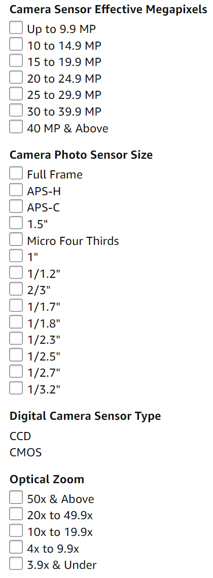
While some attributes are optional, it is important to avoid offering irrelevant attributes, such as offering the megapixels attribute when shopping for a pair of jeans.
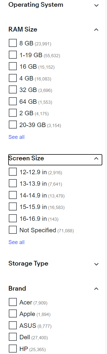
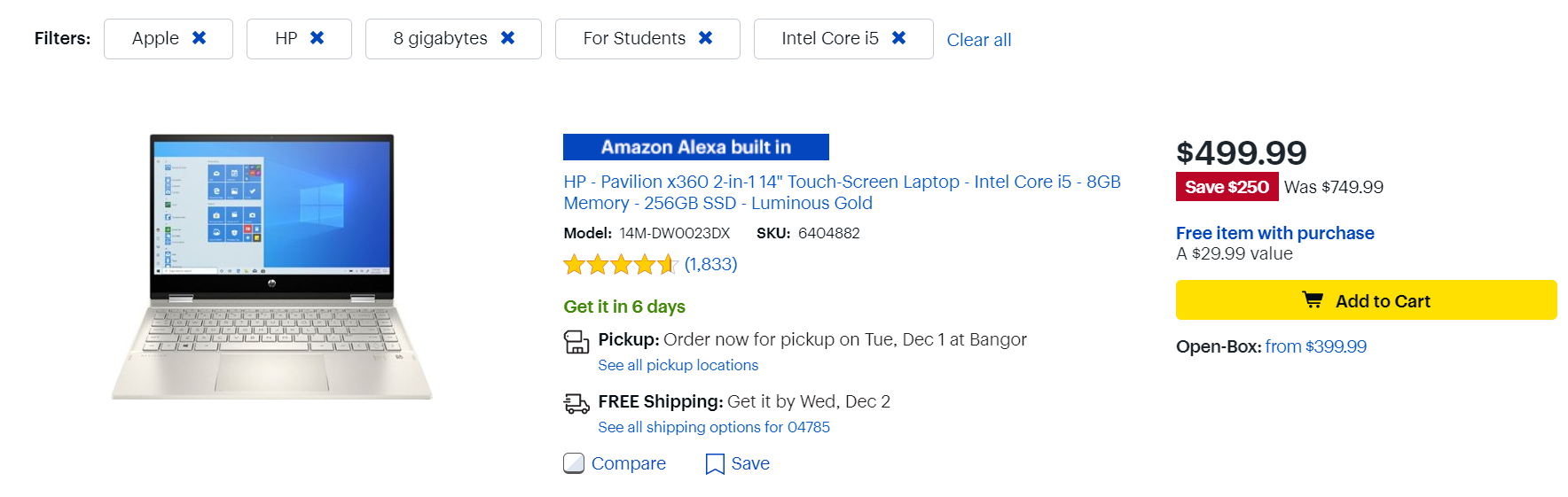
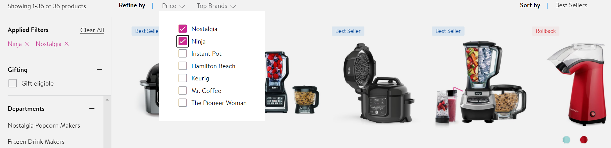
2. Show Values to Increase User Experience Attributes are usually shown in the navigation bar, and you can display them in different ways. The values listed beneath the attribute may be links, directing the customer to a different page when clicked on. Another option is input fields, which are mostly useful for price and dimension attributes. Checkboxes is yet another option, which allows the customers to select multiple values.
However, the most popular way of displaying values, which is the preferred method in all the major online stores, is an integration of several displays. Below you can see how Amazon displays each attribute’s values: each value includes a checkbox for multiple selection, and is also clickable. In addition, Amazon offers input fields for the price attribute, as well as linked values of different price ranges.
Another method of display is using a horizontal navigation bar at the top of the page. However, due to space limitations, often it doesn’t show all available attributes, which forces the shopper to take specific actions in order to see them all. In addition, the value can only be displayed in a drop-down menu, which is also quite limiting. Horizontal bars are not recommended as they make for a bad customer experience.
There is no magic solution that fits all circumstances. Each store is unique, and it is up to the seller to know which display best suits the store and the customers’ preferences.
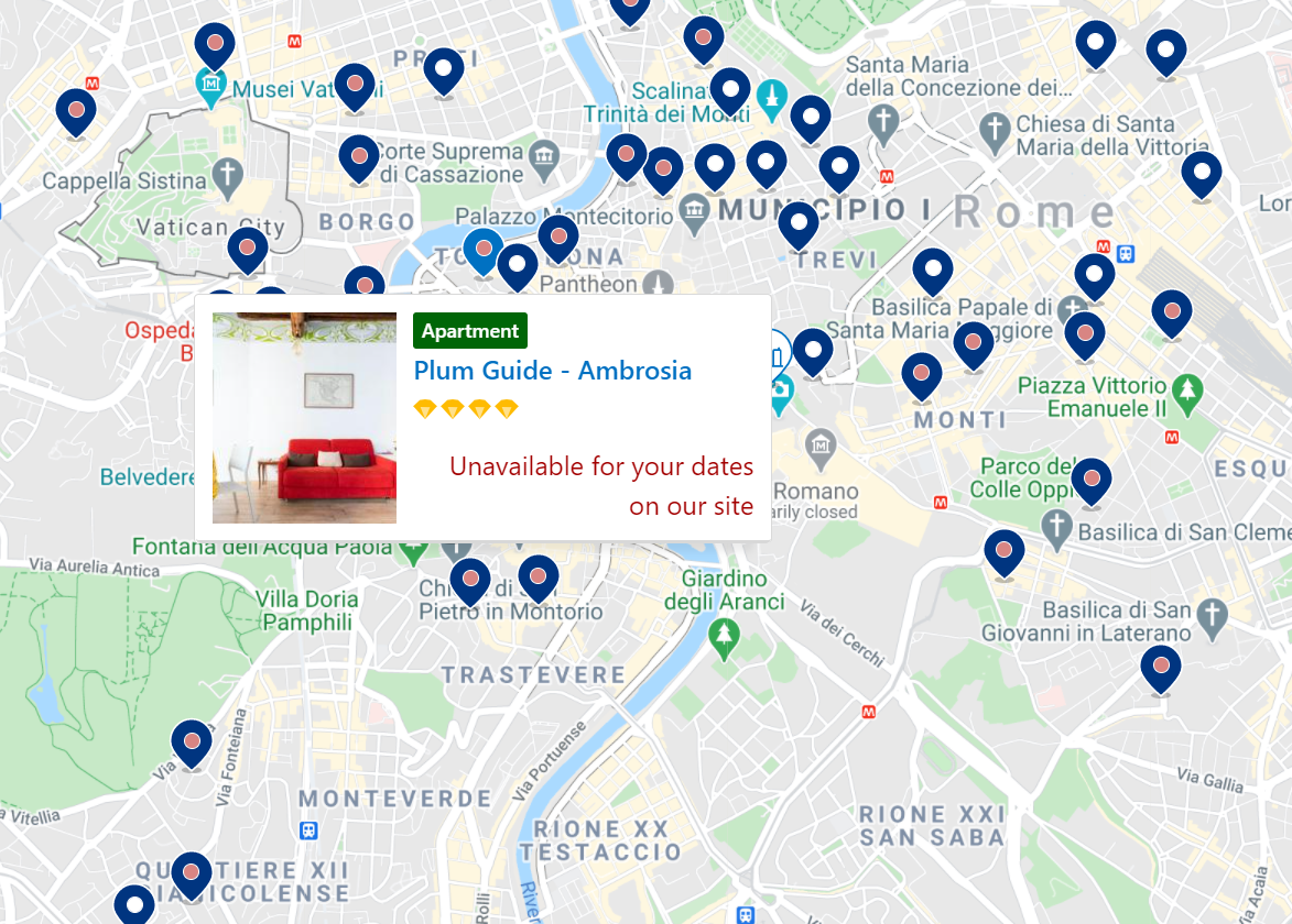
3. Use Visual Attributes Visual attributes are becoming more and more popular. They are not limited to selecting styles and colors, but have a variety of uses. For example, when searching for a hotel in Booking.com, one of the most relevant attributes is location, which may be displayed on an interactive map.
4. Offer Unique Attributes Depending on the preferences of your customers, it may be recommended to create attributes that are specific to your store or ones that are relevant to your customers. Book Depository, for instance, offers its customers to browse through some unique attributes such as “Beautiful Books” and “The Best of 2020”, on top of the basic attributes of genre, author, language, etc. These unique attributes may help the customers zoom in on what they are looking for, or help them decide what they are looking for. Once again, it is recommended to study your customers’ preferences and habits so you can more accurately cater to them.

5. Be Clear Site navigation’s main purpose is to make shopping easier and more convenient for your customers. Therefore it is very important that all the attributes are clear and relevant, and not overwhelming and confusing. As mentioned before, there is no one way of doing things, and there well may be more than one “correct” way. Sellers should invest the time in studying what their customers want, and adjust accordingly.
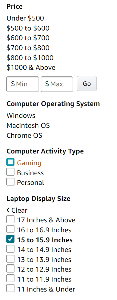
6. Use Logic When Displaying Values Values may be sorted under the attributes in different manners. They may be sorted alphabetically, as is often the case with the ‘Brands’ attribute, or numerically in ascending or descending order, when the values contain numbers, such as in price and dimensions. Some values may be sorted according to the number of products that correspond to these values.
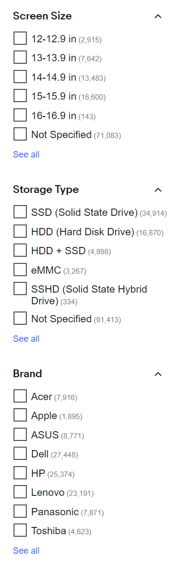
But as usual, the best option is integration of several options. In the example below we can see how Ebay is doing just that. When searching for a laptop, the values of the ‘Screen Size’ attributes are sorted in an ascending numerical order; the values of the ‘Storage Type’ attribute are sorted by the number of corresponding results; and the values of the ‘Brand’ attribute are sorted alphabetically.
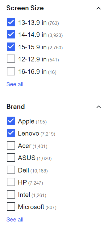
7. Allow Multiple Selection of Attributes Since each attribute pertains to a different characteristic of the product, the customers must be allowed to refine their searches by selecting multiple attributes. A customer looking to purchase a laptop, but doesn’t know exactly which one, may want to refine the results to see only laptops with screen size between 13 and 15 inches, by Apple and Lenovo only.
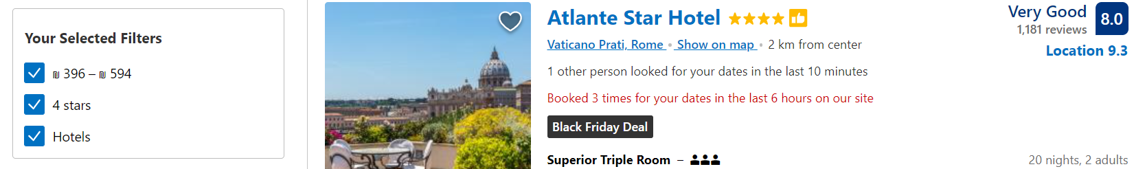
8. Show Customers Their Selection Site navigation should be easy and convenient, and the customers should be able to move efficiently through the store by selecting or deselecting attributes. In order for them to do that, sellers should always indicate to the customers exactly where they are in the store. This may be done in three way:
Emphasis - The most common way to display the customer’s location is by emphasizing the attribute selection within the navigation bar. This is usually done by displaying the selection in bold, often with a checked box.
Breadbox - All the attributes that were chosen are shown inside the box at the top of the navigation bar. When using this method, it is recommended to include both attribute and selected value in the breadbox.
Breadcrumb - The breadcrumbs that follow the customer’s journey in the websites appear at the top of the result page. Each attribute the customers selects is added to the trail of crumbs, most often with an easy option to remove it instantly.
Interactive breadcrumb - The same as breadcrumb trail, with a difference that customers may change their selection from within the breadcrumb.
9. Eliminate ‘No Results’ One of the most frustrating things for customers of eCommerce websites is when you get no results for product search. One way you can avoid no results is by always recommending your customers related products to the ones they searched for. It helps to keep the navigation bar dynamic, depending on your inventory. For instance, if you sell cameras and run out of Canon 120MP cameras, it is recommended to disable this attribute combination, until you restock on cameras. Meaning, when a customer selects the value ‘Canon’ from the ‘Brands’ attribute, the ‘120MP’ value in ‘Resolution’ attribute will be unselectable.
We hope you will find these 9 tips to improve site navigation useful and applicable to your online store. Remember, site navigation is the backbone of your website, so it is best you get the most out of it.