Is your store UX really prepared for mcommerce?

The efficiency of mcommerce websites is best expressed in the website’s navigation function, which allows customers to find their products quickly and with very little search query typing.
In recent years, ecommerce’s popularity has increased widely among consumers. Technological advancements have allowed us to save time and bypass the hassle of actually going to the store or the mall, by doing our shopping conveniently from home. But the technological advancements that brought us this far are now pushing up a different kind of ecommerce - mcommerce. And it’s about to take over.
The difference between the two is that while ecommerce means shopping online using your PC browser, mcommerce means shopping online using a mobile device, usually a smartphone. As smartphones are becoming more and more an integral part of our daily lives, the move from ecommerce to mcommerce is only natural. In fact, studies show that mcommerce comprised over 25% of ecommerce in 2019, and its share is expected to reach 45% of the ecommerce market by 2024. This trend should alert online marketplaces to be prepared for the rise of mcommerce.
The move from ecommerce to mcommerce requires adjustments from marketplaces. Alongside the growing use of smartphones, shoppers are becoming more sophisticated and tech-savvy, and they know what they like. The days of having to navigate on a small screen, scroll down an endless list of products, or trying to type in a search without even seeing the search bar are gone. Mcommerce customers care about efficiency. They know what they want to buy, and they want to find it as quickly as possible. Unfortunately, most online stores and marketplaces are way behind in this aspect. Their websites cannot cater to the demands of this fast growing segment of customers, and this might have disastrous results. The efficiency of mcommerce begins and ends with navigation. Due to the size of smartphones today, mcommerce shoppers prefer to navigate through the marketplace only by clicking, instead of typing in searches, as we did in the more traditional ecommerce. As we said before, mcommerce shoppers know exactly what they want, and navigation allows them to narrow their searches by defining the specific attributes of the product they want to buy.

You might ask yourself why would you want to limit the number of products shown to the customer. The wider the variety - the better, right? Actually, no. First, studies show that there is such a thing as ‘too much variety’, and that consumers actually perform better when they have a limited selection to choose from. They are actually more satisfied with their selection afterwards. That means that if you offer the customers 5 products to choose from, the conversion rate will actually be higher than if you would offer them 10 products. The second reason to limit the number of products is, again, efficiency. As we know by now, mcommerce shoppers don’t visit online stores to window-shop. They go there because they want to buy something specific, so giving them a wide selection of irrelevant products may be ‘too much variety’ and might hurt conversion rates.
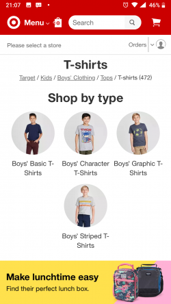
Now that we understand why it is important to offer customers only what they are interested in, let’s see how navigation works. In mcommerce navigation, the customers begin with clicking through (no more typing, remember?) the categories they are interested in, and then refinening their results according to the product’s attributes. For example, if we are looking for a pair of men's jeans, we will click the “men’s clothings” category, then the “Jeans” sub-category. Once we get back the results, we begin refining them by selecting the desired attributes (size, color, brand, fit, wash, etc.).

In order for navigation to work well and produce relevant results, all the products in the store must be properly tagged. Tagging is the process in which products are assigned the values of their attributes (for example, color: red; size: M etc.), so that they show up in relevant navigation refinements. Tagging a product with all of its attributes significantly increases the probability it will show up in refined navigation, giving it a much wider exposure. In contrast, when a product is not properly tagged, it increases the chances it will not appear in refined searches, and this means a missed sale opportunity. Tagging is essentially what guarantees that the navigation refinement brings back to the customer a limited number of the most relevant products to the customer. That is exactly what we want.
Visual aids always help, so let’s look at an example. Amazon has always been at the forefront of ecommerce, so it is no surprise that it is also at the forefront of mcommerce. Amazon’s mobile version is the standard all other mcommerce websites can aspire to. At the top of the homepage, above the search bar, and right next to the website’s logo, we find the ‘categories’ button. Even better, right below the search bar we can also find an interactive ‘top department’ bar, where customers can simply swipe their way to their preferred category. This is what mcommerce is all about - get you to your destination as fast as possible.
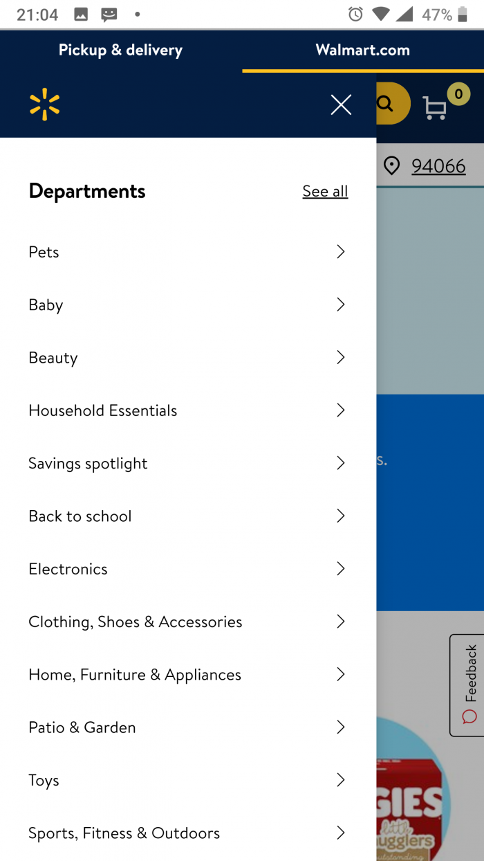
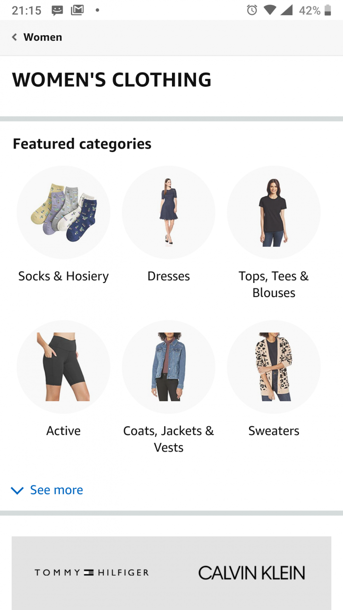
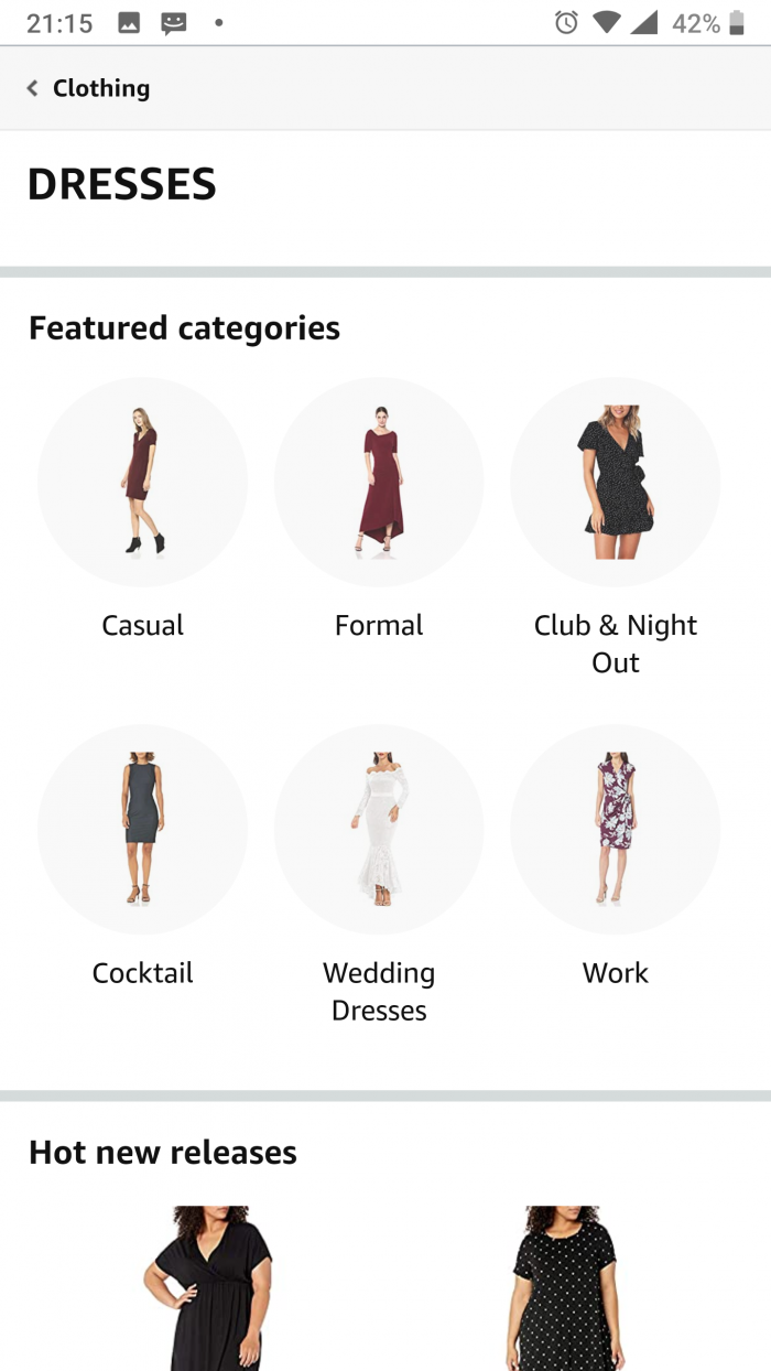
Clicking on the ‘categories’ icon opens a menu that allows you to navigate to different categories. Today we are looking for a black casual dress for women, so we navigate to the ‘Women’s Clothing’ department. There, we again see a lovely interactive ‘featured categories’ section, where we continue to navigate all the way to the ‘women’s dresses' subcategory.

Once we reach the desired category, we begin refining our results using the filters. However basic filers are made visual and enable us to select a dress type. While the wording refers to the type as 'subcategory' in fact we are dealing with with the fist navigational filter AKA facet.

Further navigation is enable using the filtering system in the navigational menu.
Unlike the numbers of product results, in the case of refinements, the more attributes the seller offers to refine by - the better the chances for the customers to find what they are looking for. Amazon is offering quite a few attributes to choose from, from the always important brand and size, to add-on items, like belts. Equally important to offering the attribute selection is the tagging of the products. If not done well, the recall of the products post filtering will be low, but if done well the customers will receive a conclusive list of products at the end of the navigation process. This list will be specific and targeted to what the customer looked for, promising a better conversion rate.
Mcommerce is set to pass traditional ecommerce in sales volume in the coming years. However, mcommerce shoppers demand different things from their online stores, mostly efficiency. The efficiency of mcommerce websites is clearly expressed in the website’s navigation function, which allows customers to find their products quickly, and with little typing and search. Despite creating mobile versions of their ecommerce websites, many sellers and marketplaces fall short when adjusting the site user experience to the specific needs of the mcommerce shoppers. Navigational features are often very limited and product tagging - the backbone of navigation refinement - is mostly overlooked. In order to stay on top in the mcommerce era, marketplaces and online stores must adjust their sites, invest in navigation infrastructure and tag their products properly.


