Mcommerce & navigation

Unlike in PC ecommerce, mcommerce customers prefer to use a simple tap navigation, rather than typing searches. Navigation, then, is set to become a key tool in growing mcommerce experience.
By any indication, mcommerce, or mobile ecommerce, is about to become the most common way to shop online in the coming years. Studies show that from 2015 to 2019 mcommerce’s share of the total ecommerce sales has doubled, and it is expected that by 2020 mcommerce will make up more than half of total ecommerce sales. However, it’s interesting to note that mcommerce gains popularity among online shoppers not because it’s easier to use than a PC, but despite the fact that it’s so much less convenient. Unfortunately, mcommerce user experience is still considerably neglected by marketplaces and online stores.
The customers’ frustration with navigating and browsing on small screens is what historically caused smartphones to suffer from poor conversion rates. We have all been there: you are trying to type in a search for an item, only for the search bar to disappear behind the virtual keyboard. Or better yet, you have to zoom in and zoom out constantly, because the mobile version on the smartphone is just too small to read (if it even fits the screen). Interestingly, and despite the growing popularity of mcommerce, there are still plenty of marketplaces that don’t even offer their customers a mobile version of the website. The fact that smartphone screens are getting bigger does not make it any better. Every seller wants his customers to have a good experience when shopping, so why would you frustrate them by making your store unapproachable? Therefore, the first step towards advancing to mcommerce is creating a proper UX and UI for the mobile version of your marketplace.
As smartphones keep developing, so does mcommerce. Recently, some marketplaces (those who thankfully do have a mobile version for their website) have learned from past poor performances, and adjusted to cater better to their customers’ preferences. One of the biggest lessons learned by these marketplaces is that many customers prefer to navigate much more than to type a search. They will type the bare minimum in the search bar (and not at all, if possible), but the rest of the way they will navigate by clicking through the different categories and attributes.
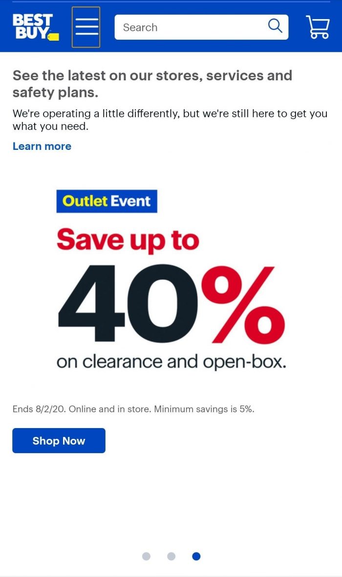
One marketplace that does it really well is Best Buy. In their mobile version, they give their customers the option to search, but notice how the navigation button (the three horizontal lines) is emphasized with a golden square around it, inviting the customers to click it. Clicking the categories button allows the customers to browse the categories they are interested in, and with some refinements, they get where and what they want.

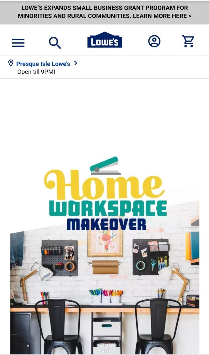
The home improvement chain Lowe’s, took it even a step further. Looking at the homepage of the mobile version of the website, we can’t even see a search bar. Again, the categories button is first on the left, followed by a search icon that opens the search bar. This is not a mistake. The people at Lowe’s understand that people don’t really want to type - they clearly prefer to navigate to their shopping destination.

If navigation is the main tool customers prefer to use in mcommerce, as shown above, then it deserves some attention. As discussed in previous articles, the quality of ecommerce navigation, both from seller’s conversion rate and the customer’s user experience standpoint, depends on the quality of the product-tagging the seller performed. Tagging is the process in which products are tagged in accordance with their attributes (such as color, size, brand etc.) when they are uploaded to the marketplace. The more attributes a product is tagged with - the better the chances for it to appear in more specific searches, and the bigger the exposure it receives. However, if a product is not tagged correctly, or worse, not at all, it will most likely disappear from any search that is even slightly refined. Every product that is left untagged or not tagged correctly means a lost sale opportunity.
Despite its importance and necessity, tagging is often overlooked by marketplaces, and in previous articles we have seen the awful results. And while incorrect tagging creates major problems in traditional ecommerce, these problems become much more critical in mcommerce, because of the heavy use of navigation. Mcommerce is ruthless when it comes to tagging, and a seller on an mcommerce marketplace that posts a product without navigational tagging might as well not post the product at all.
As mcommerce keeps increasing its ecommerce market share, and likely to soon pass the more traditional types of ecommerce, marketplaces have to listen to their customers’ demands and adjust accordingly. Unlike in PC ecommerce, many mcommerce customers prefer to use navigation, rather than typing searches. Navigation, then, is set to become a critically important tool in ecommerce. And since tagging is at the very core of navigation, all the ecommerce world is now learning of the significance of it.


