Site navigation – a basic element of the shopping experience

As retailers and private sellers are rushing to capitalize e-commerce vast potential, many fail to provide their customers with the shopping experience they have come to expect. In fact, most e-commerce sites lack the basic infrastructure that allows the most basic element of the shopping experience - site navigation.
The popularity of e-commerce is evident by the explosion of new online stores, marketplaces and other sale channels in recent years. Online retail is constantly on the rise, rapidly enlarging its retail market share. But as retailers and private sellers are rushing to capitalize e-commerce vast potential, many fail to provide their customers with the shopping experience they have come to expect. In fact, most e-commerce sites lack the basic infrastructure that allows the most basic elements of the shopping experience - site navigation.
Site navigation is what allows customers to narrow down initial results, by selecting the relevant attributes of the product they are looking for. Alternatively, customers may use site navigation to browse the site, and have a better look at the different categories of products sold in the store.
As essential as site navigation infrastructure is, many sellers neglect this aspects of their store. Many provide too few attributes to select from, or irrelevant one, and this makes it more difficult for customers to find what they are looking for. This frustration quickly causes them to leave the store, and in the highly competitive world of e-commerce, they are not likely to return.
Luckily, this situation is avoidable. In this article we will review some best practices sellers can implement in their own stores, that will have an instant impact on performances. Some are rather simple, while others require infrastructure changes, but compared to the benefits, the investment is certainly worth it.
- Use Category-Specific Attributes
These types of attributes are different from the general attributes that appear in all categories (such as brand, price, user reviews etc.), in that they are relevant only to specific categories of products. For instance, the Screen Size attribute is one of the most important attributes in the Laptops and Mobile Phones categories, just as the Genre attribute is important in the Books category. However, offering these attributes in the Clothing category would be a mistake, as they are totally irrelevant there. Still, many sellers don’t offer enough category-specific attributes to satisfy their customers.
As a general rule, sellers can use the product description to learn which specific attributes to offer, since it is reasonable that the description contains the most important information about the product. In addition to being the attributes most relevant to the customers, relying on the product description might help sellers include new helpful attributes that the customers did not expect. Sellers can use the category-specific attributes to show customers which of the product’s features are important, or offer new relevant attributes.
In order to allow customers to better navigate the store and thus improve the shopping experience, it is recommended to use these category-specific attributes, because they are highly sought after by customers. Sellers need to study the preferences of their customers, and look into what their competitors are doing, in order to get a better understanding of which category-specific attributes they need to add.
- Show Most Relevant Attributes on Top of the Results Page
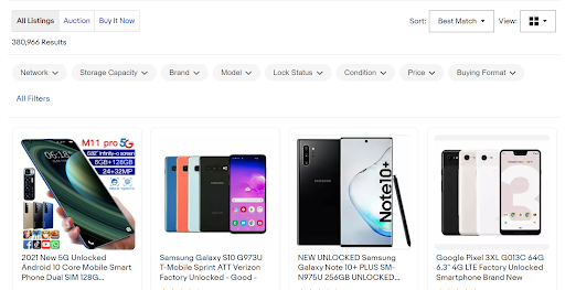
As discussed above, it is recommended to use category-specific attributes in different product categories, because they allow customers to easily navigate the results. However, since these attributes are the most important to products in the specific category, simply adding them to the navigation bar might cause customers to overlook them. To avoid customers missing them, it is recommended to put the most important and most relevant attributes at the top of the search results. When displayed at the top of the page, there is no chance of the customers missing them. Not only that, but just displaying these attributes at the top of the page may entice customers to use them.
As with everything, it is important to remember not to over do it. Sellers may be tempted to promote a lot of attributes to the top of the page, which is a mistake since it will quickly return very few results back. Therefore, only the most popular and relevant attributes should appear at the top.
Here are 4 key points to keep in mind when deciding on which attributes to promote to the top of the page:
- Relevancy - the attributes do not have to be related to each other. They only need to be the most relevant to the customers in this specific category, with a high likelihood of them using it. For example, when visiting the Laptops category on Ebay, customers are offered the RAM Size, OS and Screen Size attributes at the top of the search results.
- Selection - before promoting attributes to the top of the page, sellers must make sure it makes sense to put them
there. Using the prior example, promoting the Screen Size attribute in the Laptops category is wise, but if the store only sells one size of screens, this attribute should not appear on top. Customers see the promoted attributes as site recommendation, and recommending a useless attribute harms the customer experience. - Continuity - promoted attributes are a relatively new feature in e-commerce. However, most sellers are not yet familiar, or they decline to make the necessary adjustments, and still use the traditional navigation sidebar. On the other hand, customers have also spent years using the sidebar, and grown accustomed to it. That is why it is important to maintain this continuity, and keep the promoted attributes in the sidebar as well, as a large portion of customers will only look for it there.
- Uniformity - some online sellers promote attributes using banners or graphics, instead of showing simple buttons. This is another sort of overdoing it, specifically since today’s customers tend to ignore banners and flashy images. Sellers need to make sure the promoted attributes look that same way they do in the familiar sidebar.
3. Allow Multiple Choice
It is highly recommended to allow customers to select multiple values within a single attribute. Many online shoppers are looking to browse the store, rather than having a specific product in mind, and allowing them to select only one value per attribute makes the entire navigation process very frustrating. It will require them to go back and forth between different result pages, memorize the relevant results, and then compare them in their head, rather than on the screen. If customers are looking to select more than two values, the process becomes exponentially more burdensome.
On the other hand, allowing multiple choice of values gives customers a greater freedom to explore the store, by narrowing results in accordance with their preferences. Some users even use multiple choice as a way to exclude irrelevant products, by selecting all values other than the irrelevant one, which then produces only relevant results.
Although this might seem a basic function, there are quite a few online stores and e-commerce platforms that still allow their customers to select only one value per attribute, making the shopping experience very frustrating. The simple switch from single to multiple value selection is a quick way to improve the overall shopping experience.
- Employ Unique Attributes
When visiting a real-life store, customers often look for more specific, and unique, categories of products. For example, one may ask for casual shoes, a waterproof coat, or good value headphones. However, although these types of queries are quite common, most online stores do not offer them to customers, despite selling these same items.
Lack of such unique attributes makes the navigation process more burdensome and lengthy, and many times customers simply give up on browsing through the results, either tiring from browsing or assuming the store does not sell the product they are looking to buy.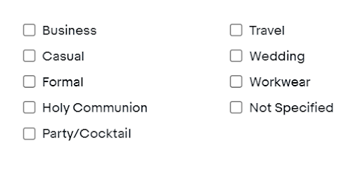
In the example above, we see one of Ebay filters in the Fashion category. It is called “Occasion”, and allows customers to select in what specific function the clothing may be worn, such as “Business” of “Wedding”.
Keep in mind that these unique attributes are highly dependent on which type of products the store sells, but they are most often used for occasions, seasons and types of usage.
- Emphasize Selected Attributes
It is highly recommended to emphasize the attributes and values selected by the customers, to help them during navigation, and remind them of their selections. Otherwise, customers are required to rely on memory, which makes for a bad shopping experience.
Here are 4 points to keep in mind when emphasizing selected attributes:
- Applied attributes should be easy to find
- The attributes by which the results are displayed should be clear
- It should be easy to add or remove attribute
- Notify the customers how many values are applied for each attribute
In order to avoid any confusion, it is recommended to display the selected attributes both in the sidebar, as well as at the top of the page. 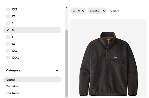
- Avoid Showing Long Value Lists
Some attributes will contain a long list of values. Attributes like color, material, length, size etc. tend to have a number of values too large to display in its entirety in the sidebar or at the top of the page. This doesn’t stop sellers from including such lists, either taking over a large proportion of the page, or incorporating a scrolling option within the sidebar. Long lists tend to discourage customers, since they cannot see the entire selection at one time.
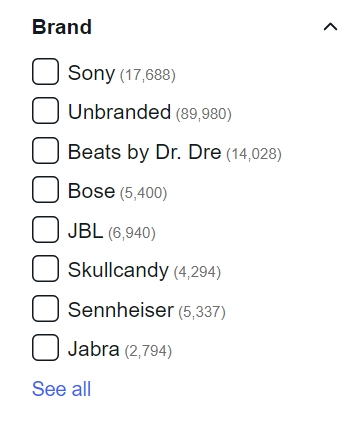
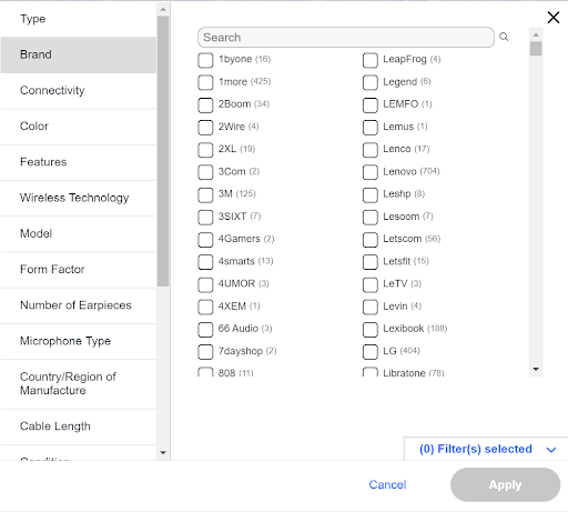
A different design is recommended, by which long lists are collapsible, with the ability to expand the list and see it in its entirety. Ebay, for example, shows customers about 8 different values, and if customers want to go further into the attribute, they can see all of the values with a simple click of the highly visible “See all” button.
- Allow Going Back
The majority of online shoppers use the back button to cancel their selection. It is reasonable to assume that once you select a value, and the page content changes, clicking back will deselect the value and return the previous results. Customers see new result pages as entirely separate pages. When going back does not meet the customers’ expectations, and takes them back too much, it causes frustration and quickly leads them to leave the store. Unfortunately, this is a very common phenomenon.
To meet the standards of the customers, sellers are advised to generate a unique URL for every value applied, and every change in sorting of the products. This makes every selection a unique page, enabling customers to use the back button freely, and provide them the user experience they are looking for.
Improve Customer Experience with Better Attribute Navigation
Site navigation is one of the most crucial aspects of the shopping experience. A properly built navigation infrastructure allows customers to slice through massive sets of data, and focus only on a manageable number of products that interest them.
Despite its importance, many online sellers tend to neglect this aspect of their business, leaving customers with a below average experience that does not entice them to return.
If you want to improve site navigation, here are the points to remember:
- Use Category-Specific Attributes
- Show Most Relevant Attributes on Top of the Results Page
- Allow Multiple Choice
- Employ Unique Attributes
- Emphasize Selected Attributes
- Avoid Showing Long Value Lists
- Allow Using the Back Button


