What’s wrong with online grocery shopping?

With the growing popularity of ecommerce, online grocery shopping has also increased. But while marketplaces improve their UI all the time, it seems that online grocery shops are left behind, with two major issues: navigation infrastructure and respective product tagging.
Online grocery shopping is becoming more and more popular, especially because almost all of us are staying at home due to COVID-19. But while every supermarket chain has a website for online shopping, many of them are very basic, frustrating, and eventually have inferior conversion rates. The reason for this is that these chains usually neglect what perhaps are the most important aspects of online shopping - tagging and navigation.
With smartphones and tablets taking over our daily lives, there’s no wonder online shopping keeps rising in popularity. In fact, it is so popular that people are now buying their groceries online as well. Studies show that online grocery shopping’s market share has increased consistently in the past five years, and it is expected to continue growing in the future. COVID-19 gave online grocery shopping a tremendous boost, because people stay at home, and must have their groceries delivered to them. When browsing through online grocery shops, pretty quickly you find out (and experience) that most of them are not nearly as good as other offline stores. The search is usually not refined enough, and leaves you with too many irrelevant results. An even bigger problem is that navigation refinements are usually very limited and are not really helpful.
There are two layers to the common navigation problem in online grocery shops: the first is a lack of navigation infrastructure, meaning your options of refining the initial search results are limited. The second layer is a poor tagging job. This means that products, if tagged with data , are tagged partially and inconsistently, which makes them disappear from searches they should appear in, leading to loss of sales.
Let’s see some examples.
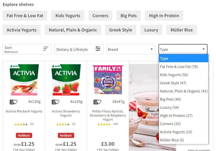
Sainsbury’s website is a prime example for lack of navigation infrastructure. At first glance there are no navigation options at all! This is a bad start. It takes a closer look to find the collapsible navigation bar, which makes you wonder why they would hide the tool I am most likely to use.
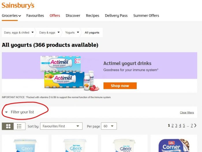
The navigation bar keeps up with the trend, and proves again that the people at Sainsbury’s pay little attention to navigation. The navigation options are limited and offer refinement only by “Brand”, “Type” and “Dietary & Lifestyle Options”, while leaving out important attributes, such as flavor and size. Instead, the last two attributes are just a bunch of less useful values.
Which brings us to the second layer - poor tagging job - in which Sainsbury’s stands out. In the tagging process each product is tagged in accordance with its attributes (in the case of yogurt, brand, weight, flavor, fat percentage, etc.) to allow customers to use navigation refinements to find exactly what they are looking for. When tagging is done right, it increases the product’s exposure and conversion rate; when it’s done wrong, as we will see, many results will be “hidden” from customers.
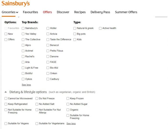
Sainsbury’s offers us 20 brands to choose from. You would expect that selecting all the brands will cover all the 366 total products. Think again. Such selection only gives you 284 results, meaning that 22% percent of all products were not tagged with the brand attribute, which is difficult to explain. 22% of all products in the yogurt category just became invisible for customers.
The other attributes are even worse. Selecting each of the values under “Type”, we get back only 150 results, or 40% of all products. The same goes to the attributes under “Dietary & Lifestyle Options”. Besides the value “Keep Refrigerated”, the rest bring back only a few results. This once more proves that Sainsbury’s has done a poor job tagging their products, despite the fact that all necessary information appears in the products’ description.
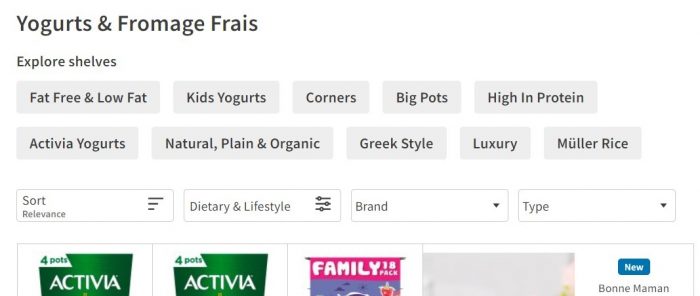
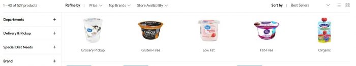
ASDA Groceries’s website is an improvement compared to Sainsbury’s website, but navigation infrastructure and tagging are still a problem. Navigating to the yogurt category brings 362 results, and unlike Sainsbury’s, we immediately see the navigation bar. But we also see the “Explore Shelves” feature, which allows customers to navigate with tags, same as in mcommerce. This demonstrates ASDA’s good understanding of online shopping and catering to the customers’ preferences. However, the main navigation bar unfortunately proves just the opposite.
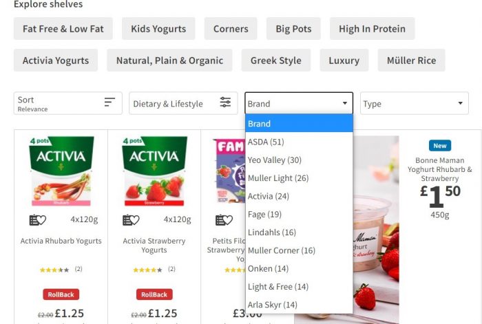
The navigation refinements at ASDA are pretty similar to the ones at Sainsbury’s, and offer only “Dietary & Lifestyle”, “Brand” and “Type”. No refinement by flavor, fat percentage, weight, or anything else, even though the products’ description contains all this information.
Tagging on ASDA's website is as bad as in Sainsbury’s. Selecting all the brands should give us a total of 362 results, but in this case we only get 224 results. This means 37% of the products in this category are not tagged with the “Brand” attribute, and will not appear in any search by brand.
Since products usually have several taggable attributes, they may be included in a number of refinement options. For example, yogurt can be low fat, greek style, and come in big pots, so the same yogurt may appear in each refinement. However, ASDA’s website allows you to only select only one choice per attribute. So, if you are looking for a greek style, low fat yogurt that comes in a big pot you cannot search for it, and anyways, you will never find it. This is a serious miss in the navigation UX and UI design.
Let’s finish with a positive. Walmart gets it, and their website provides one of the best user experiences of any online grocery shop. Navigating to the yogurt category brings up 527 results. The first thing you see is a touch navigation bar, like at ASDA’s only visually much better.
Walmart’s navigation bar is much broader than the others. It allows customers to refine their search by the usual “Brand”, “Type” and “Special Dietary Needs’, but also by “Flavor”, “Pot Size”, “Pot Count” and “Form”. This is how infrastructure should be done. But while Walmart definitely invested in the navigation infrastructure, it still has tagging problems. For example, under “Brands” there are three different values for “Nestle”, each with a different spelling, and each is tagged for a different product, meaning that choosing one will show 1 result even though there are at least 3. There is room for improvement in tagging, but overall, Walmart is doing a good job.
With the growing popularity of ecommerce, online grocery shopping has also increased. But while marketplaces improve their UI all the time, it seems that online grocery shops are left behind, with two major issues:
- Lack the basic navigation infrastructure needed to cater to the customers’ preferences
- Serious neglect of tagging, which drastically decreases product exposure
So, as online grocery shopping becomes the way we buy groceries, these websites must improve their navigation infrastructure and tagging to meet the needs of customers.